
WanderKit
From February to December 2024, I worked as a product design intern. Since December 2024, I've been working as a junior product designer at WanderKit, where I redesigned the onboarding screens.
ROLES
UX Design
UX Research
COLLABORATION
Engineers
Product Manager
CEO
TOOLS USED
Figma
DURATION
Feb 2024 - Present
Initial Problem Discovery
Problems
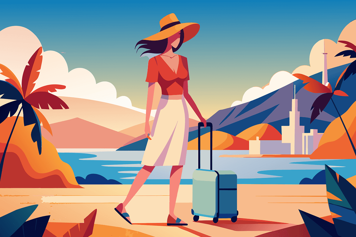
You’re traveling alone in Spain. You’re feeling lonely and want to make new friends to enrich your travel experience. So you download WanderKit. You discover an exciting event on WanderKit and plan to join it to meet other WanderKit users.
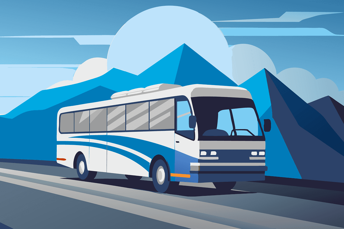
To attend the event, you’ll need to take a bus to the venue. But figuring that out in an unfamiliar area with an unfamiliar language makes it extremely difficult. You're excited to meet new people, but you're also a little hesitant because they aren't verified. That’s why WanderKit was created—to make it easy and safe to connect with others even in an unfamiliar place.
WanderKit's Values


Original Onboarding Flow
However, WanderKit’s original onboarding flow isn’t user-friendly. Meeting new people in a foreign country is already difficult, and WanderKit’s unintuitive design makes it even more difficult.
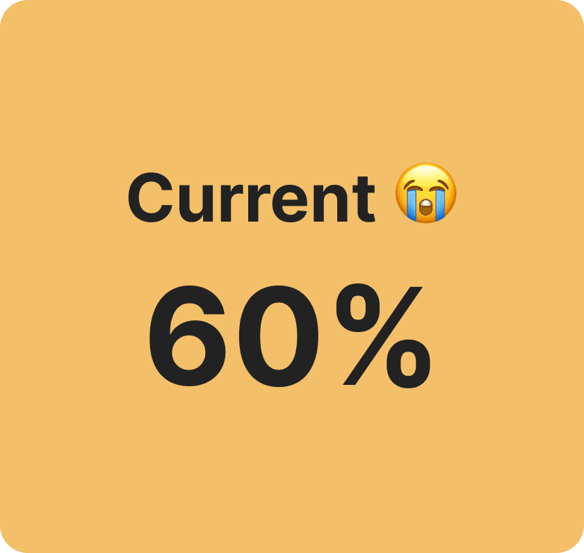
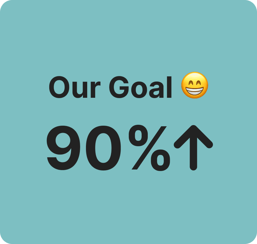
Task Success Rate
When we conducted user testing with 10 people using the original onboarding screens, the success rate was only about 60%. Our goal is to exceed 90%.
Time on Task
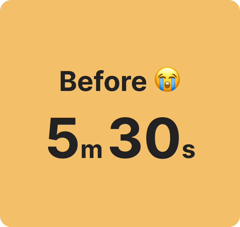
During user testing with 10 participants, the original onboarding screens resulted in an average time on task of 5 minutes and 30 seconds. Our target is to streamline the experience to under 4 minutes and 30 seconds.


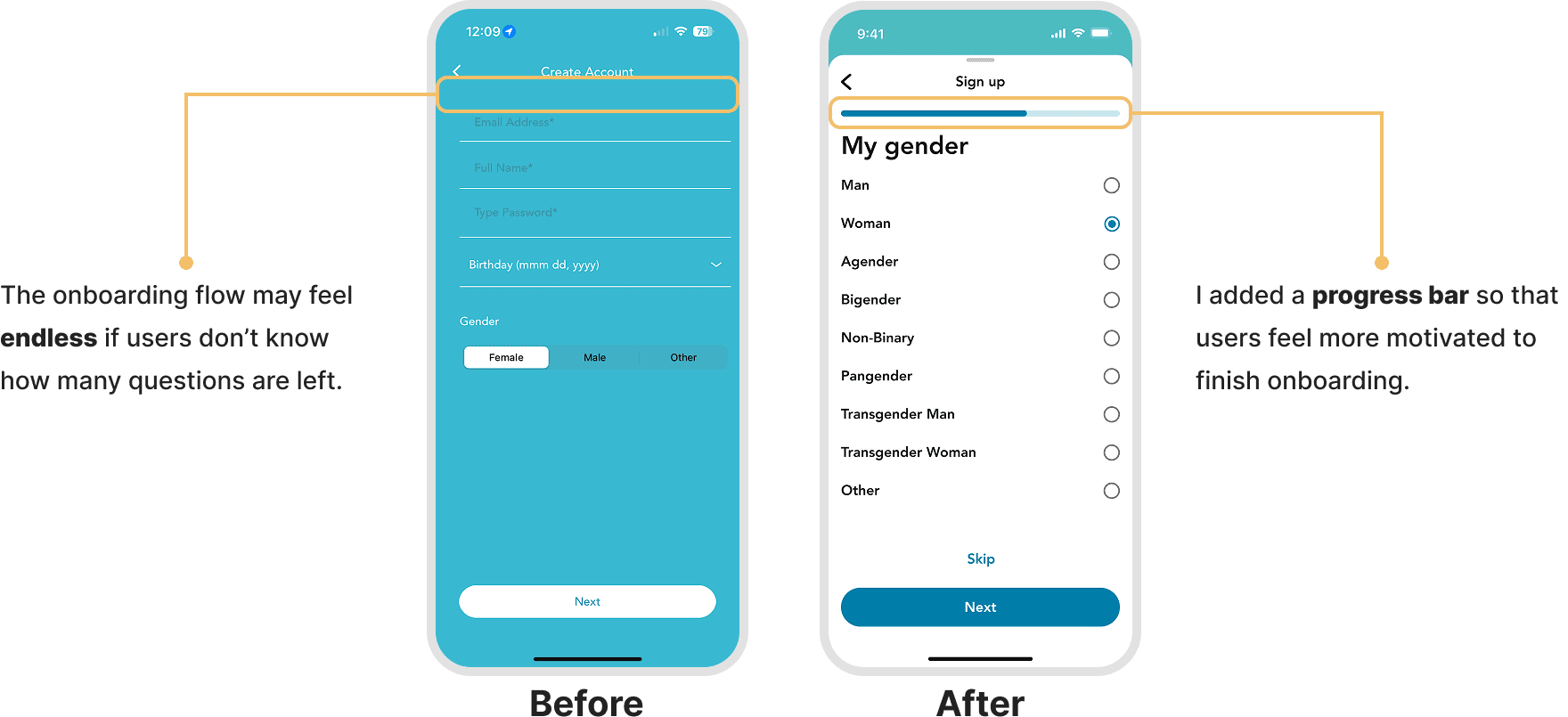
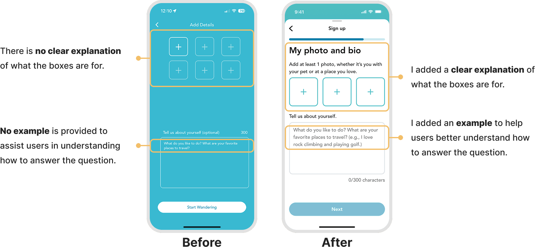
Problem 01 Contrast & Text Size
The left screen is the original onboarding screen, and the right screen is the new one I designed. WanderKit’s developers are currently updating the app with the new onboarding screens, which will be released soon.

Problem 02 Multiple Questions

Problem 03 Progress Bar
Problem 04 Lack of Guidance
Problem 05 Broad Categories

Problem 06 Spam & Abuse

User Testing & Design Options
Date Picker

I created 3 different designs for the birthday question. After conducting user testing with 10 participants, here are the results and the decisions I made:
❌ Option A: Some participants mentioned that it required too much scrolling for them, as they were born many years ago (e.g., in the 1960s).
❌ Option B: The customized date input field may result in developers spending more time on implementation.
✅ Option C: This date input field is from the Material Design Kit, enabling faster development through the use of pre-built components.
Categories
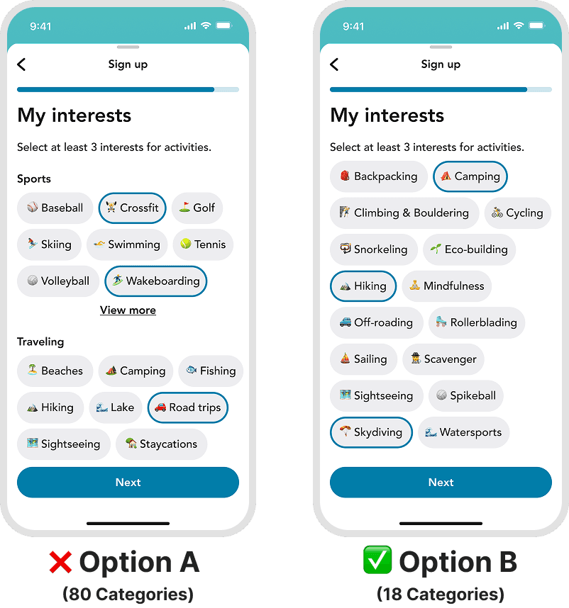
I created 2 different designs for the 'My Interests' question. After conducting user testing with 10 participants, here are the results and the decisions I made.
❌ Option A: WanderKit’s landing page displays upcoming events based on the categories users select during onboarding. If there are too many categories, the landing page may show irrelevant results, especially with a smaller user base and fewer events.
✅ Option B: By offering fewer categories, WanderKit allows users to discover relevant events, enhancing engagement. WanderKit will increase the number of categories as our user base grows.
Task Success Rate
When I conducted user testing with 10 participants using the old onboarding flow, the task success rate was only 60%. With the new onboarding designs, the success rate increased to 100%, exceeding our goal.


Time on Task
When I conducted user testing with 10 participants using the old onboarding flow, the average time to complete the onboarding process was 5 minutes and 30 seconds. With the new onboarding designs, it dropped to just 4 minutes and 15 seconds, clearly demonstrating that we successfully achieved our goal.

What I learned
Through this project, I learned how a thoughtful onboarding experience can build user trust from the very first interaction—especially when users are in unfamiliar and vulnerable situations, such as traveling alone in a foreign country.
By making onboarding more intuitive, accessible, and personalized, users were able to understand the value of WanderKit quickly, feel safe connecting with others, and begin exploring with confidence.
This project taught me the importance of designing for clarity and reassurance in social apps, especially those focused on real-world interactions. I also learned how to balance user needs with engineering constraints by leveraging systems like the Material Design Kit for faster development.